
Most line graph answers fail the same way. They describe every line, left to right, in order.
That answer covers the data and stays inside the word limit. It still lands at band 6.
Task Achievement is not asking you to report the numbers. It is asking you to say what the numbers do.
So make one decision before you write a word: which lines belong together?
How to Group the Lines
Sort the lines by behaviour, not by the legend.
Four lines might be two groups. Three that climb and one that collapses. A leader and three followers. Two that cross and two that never move.
That grouping is your organising idea, and it decides your body paragraphs.
The most reliable split is rising against falling. One paragraph for the lines that grow, one for those that decline or stay flat. It works on most graphs and it forces comparison instead of narration.
Compare these two. “Sales of tea rose while coffee fell” is a comparison. “Tea was 20 in 1990, 30 in 1995, 45 in 2000. Coffee was 50, 40, 25” is a table read aloud.
Here is the test. Try to state the whole graph in one sentence without numbers.
Everything rose except imports, which fell steadily after 2005.
If you can write that sentence, you have found the grouping. It is also your overview, and the two groups it names are your two body paragraphs.
Line Graph Structure
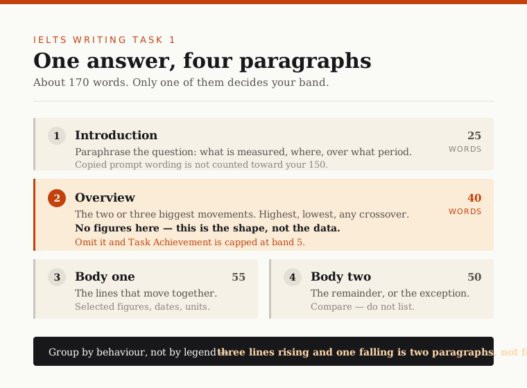
- Introduction, about 25 words. Paraphrase the prompt. What is measured, where, over what period.
- Overview, about 40 words. Two to four main movements. No figures.
- Body one, about 55 words. The first group, with selected data.
- Body two, about 50 words. The second group.
The Introduction
Paraphrase the prompt. Do not copy it. Change the wording rather than reusing it.
This is not a style preference. Words copied from the prompt are discounted from your word count, and heavily memorised template openings can be excluded from assessment as well.
You need 150 words. If the exclusions drop you below that, Task Achievement takes an automatic penalty, and an under-length answer rarely scores above band 5 on that criterion.
Say the prompt reads: “The graph below shows the number of visitors to three London museums between 2010 and 2020.”
Write something like: “The line graph compares visitor numbers at three museums in London over a ten-year period from 2010.”
One grammar point inside that sentence, because it is a common slip. Write “a ten-year period” — article, hyphen, singular year — when the phrase modifies a noun.
The Overview
The overview carries the most weight of any paragraph. Put two to four major movements in it:
- the general direction of most lines
- which line dominates, and which sits lowest, across the whole period
- any crossover, reversal or dramatic exception
No figures. Not one. Numbers are evidence for the body paragraphs. The overview is the claim they support.
“Visitor numbers rose overall, with the Science Museum overtaking the National Gallery in 2016” is an overview. “Visitors rose from 2.1m to 3.4m” is a detail in the wrong paragraph.
Signpost it so it cannot be missed: Overall, or In general, or The most striking feature is…
The Body Paragraphs
One paragraph per group. State what the group does, then support it with figures.
Select them. Do not list them. Choose three to five key features — start and end values, peaks, troughs, crossover points — and build around those.
A graph with four lines and six time points holds twenty-four data points. An answer that reports all of them has made no decisions.
Blend the figures into your sentences. “Both rose sharply, though the Science Museum climbed faster, adding 800,000 visitors against the Tate’s 300,000” does more work than two separate statements.
When a point falls between gridlines, do not invent precision. Approximation is a band 7 feature, not a hedge: approximately 10,000, just under 2,500, in the region of 40 per cent, roughly double.
Line Graph Language
Tenses
Match the tense to the dates on the graph. The rule is mechanical, and getting it wrong is an avoidable Grammatical Range and Accuracy cost.
- Dates entirely in the past → past simple throughout. Numbers rose, then fell sharply.
- No dates on the graph → present simple.
- A projection beyond today → future forms, for that portion only.
Vary how you express the period instead of repeating one phrase: between 2010 and 2020, from 2010 to 2020, over the following decade, over the given period.
Vocabulary
Task 1 vocabulary is smaller than you think. Lexical Resource rewards precision and flexibility of form, not a thesaurus.
| Direction | Verb | Noun |
|---|---|---|
| Up | rise, climb, increase, grow | a rise, an increase, growth |
| Down | fall, decline, drop, decrease | a fall, a decline, a drop |
| Flat | remain stable, level off, plateau | stability, a plateau |
| Peak | peak, reach a high of | a peak, a high |
Modify with degree (sharply, steadily, gradually, slightly, marginally) and speed (rapidly, slowly).
Switch between the two forms to show range. “Numbers grew significantly” and “there was significant growth in numbers” say the same thing with different grammar. Alternate them and you demonstrate flexibility without learning a single new word.
Fix these three. They appear in almost every band 6 script.
- Do not put a weak adverb on a strong verb. Surge, soar, rocket, plummet, plunge already contain their intensity. “Plummeted gradually” contradicts itself.
- Percentages and percentage points are not the same. A move from 20% to 30% is ten percentage points, or a fifty per cent increase. Only one of those is what your graph shows.
- Twice as many, twice as much. Use many for countable data: visitors, cars, students. Use much for uncountable: water, revenue, electricity.
How It Is Marked
Four criteria, 25% each: Task Achievement, Coherence and Cohesion, Lexical Resource, Grammatical Range and Accuracy.
On line graphs, Task Achievement caps most competent answers. Inside it, the overview.
The public descriptors ladder like this:
- Band 5 — recounts detail mechanically, with no clear overview
- Band 6 — a relevant overview is attempted
- Band 7 — presents a clear overview, with data appropriately categorised and main trends identified
An attempt gets you 6. Clarity gets you 7. The whole gap lives in about forty words.
Two more penalties land before anyone reads your English.
Under-length costs Task Achievement. The minimum is 150 words, counted after copied prompt wording is discounted. An under-length answer is unlikely to exceed band 5 on that criterion however good the rest is.
Speculation is marked down, not ignored. A line graph shows what happened, not why. Do not explain a fall as the result of a recession the graph does not show. That is unsupported content and it costs you marks.
On Grammatical Range and Accuracy the band 7 requirement is frequent error-free sentences. Write three clean sentences instead of one sprawling one. The ambitious version scores lower.
Line Graph Sample
Here is a task in the standard format.
The graph below shows the number of visitors to three museums in a European city between 2010 and 2020.
Summarise the information by selecting and reporting the main features, and make comparisons where relevant.
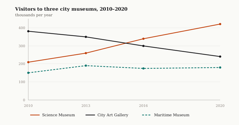
Look at what the data does. Two lines move decisively in opposite directions and cross. A third barely moves. That is your grouping, and you can see it before you write anything.
Band 6 Model Answer
The graph below shows the number of visitors to three museums in a European city between 2010 and 2020. Overall, there were some changes in the visitor numbers of the three museums.
In 2010, the Science Museum had 210 thousand visitors, the City Art Gallery had 380 thousand and the Maritime Museum had 150 thousand. In 2013, the Science Museum increased to 260 thousand, the City Art Gallery decreased to 350 thousand and the Maritime Museum increased to 190 thousand. In 2016, the Science Museum was 340 thousand, the City Art Gallery was 300 thousand and the Maritime Museum was 175 thousand. Finally, in 2020, the Science Museum reached 420 thousand, the City Art Gallery dropped to 240 thousand and the Maritime Museum was 180 thousand.
Every statement in it is true, and it would struggle to pass 6.
Band 7 Model Answer
The line graph compares visitor numbers, in thousands, at three museums in a European city over a ten-year period from 2010.
Overall, the Science Museum and the City Art Gallery moved in opposite directions, with the former overtaking the latter around the middle of the period to become the most visited. The Maritime Museum, by contrast, changed very little and remained the least popular throughout.
The Science Museum grew consistently, rising from 210,000 to 420,000 — a doubling over the decade. The City Art Gallery declined at a similar steady rate, falling from 380,000 to 240,000. The two crossed at approximately 320,000 in around 2015, after which the gap widened in the Science Museum’s favour.
The Maritime Museum showed no comparable trend. Having climbed from 150,000 to 190,000 by 2013, it slipped back to just under 180,000 and then remained broadly stable for the rest of the period, ending roughly 60,000 above where it began.
Six Differences
The introduction is paraphrased, so all of it counts. Band 6 copies the prompt word for word, which is discounted and leaves roughly 150 words of body.
The overview names the shape and gives no figures. Opposite directions, a crossover, a leader that changes, one line that does nothing. Four movements, zero numbers. That is the gap between “attempted” and “clear”.
The body groups by behaviour. The two decisive movers share a paragraph because they tell the same story. The static line gets its own. In the band 6 version each paragraph is a year, so the crossover never gets mentioned — even though every number needed to spot it is there.
Figures are selected, not listed. Twelve data points exist. Band 7 uses seven, and each one marks something: two start values, two end values, the crossover, the Maritime peak and trough.
Approximation where the graph is imprecise. Approximately 320,000, in around 2015, just under 180,000. The crossover has no gridline, so a precise figure would be a guess presented as fact.
Comparison is built into the sentences. At a similar steady rate, the gap widened, roughly 60,000 above where it began. Each one links two things instead of reporting one.
Do’s and Don’ts
| Do | Don’t |
|---|---|
| Group the lines by behaviour before writing | Walk through the graph year by year |
| Paraphrase every word of the prompt | Copy the prompt — it is discounted from your count |
| Put two to four movements in the overview | Put a single figure in the overview |
| Choose three to five features and build on those | Report all the data because it is there |
| Approximate when a point falls between gridlines | Invent a precise number you cannot read |
| Match the tense to the dates on the graph | Mix tenses across paragraphs |
| Write three clean sentences | Write one long sentence carrying four ideas |
| Say what happened | Say why it happened |
Practice
Write one line graph answer, get it assessed against the four criteria, then write the next one. Repeating a weakness ten times embeds it rather than fixing it, so you need the feedback between attempts.
You can check a Task 1 answer with the IELTS writing checker: paste the question and your response for an estimated band. It scores Task Achievement, Coherence and Cohesion, Lexical Resource and Grammatical Range and Accuracy separately, so you can see which one is holding your band down.
Related: how to describe a table covers the same data without the visual trend, how to describe a process diagram covers the non-data tasks, how to describe mixed charts covers tasks with two visuals, IELTS Writing Task 1 explained covers format and timing, and how the writing band scale works explains what each criterion rewards.
Frequently asked questions
- How do I write an overview for an IELTS line graph?
- Put two to four major movements in it: the general direction of most lines, which line dominates and which sits lowest across the whole period, and any crossover, reversal or dramatic exception. Signpost it with 'Overall' or 'In general' so it cannot be missed.
- Should I include numbers in a line graph overview?
- No, not one. Figures are evidence for the body paragraphs and the overview is the claim they support. Saying visitor numbers rose overall, with one museum overtaking another in 2016, is an overview. Saying visitors rose from 2.1m to 3.4m is a detail in the wrong paragraph.
- How many figures should I include in a line graph answer?
- Three to five key features, chosen deliberately: start and end values, peaks, troughs and crossover points. A graph with four lines and six time points holds twenty-four data points, and an answer that reports all of them has made no decisions, which is what selection is marked on.
- What tense should I use for a line graph?
- Match the tense to the dates on the graph. Dates entirely in the past take the past simple throughout. A graph with no dates takes the present simple. A projection beyond today takes future forms, but only for that portion.
- How many paragraphs should a line graph answer have?
- Four. An introduction of about 25 words paraphrasing the prompt, an overview of about 40 words with no figures, then two body paragraphs of roughly 55 and 50 words, one for each group of lines.
- Can I explain why a line graph trend happened?
- No. A line graph shows what happened, not why. Explaining a fall as the result of a recession the graph does not show is speculation, and it is marked down as unsupported content rather than simply ignored.