
Two visuals look like twice the work. They are not. You still write 150 words and you still have 20 minutes.
Most candidates react by reporting everything on both charts. The answer runs long, loses its shape, and eats the time Task 2 needed. Task 2 is worth twice the marks.
One question fixes this, and you answer it before you write a word: do the two visuals share categories?
Do the Visuals Share Categories?
Mixed tasks come in two shapes. They need opposite structures.
The visuals share categories. Two pie charts of the same sectors in different years. A bar chart and a line graph tracking the same countries. You have one dataset shown twice, so compare across the visuals.
Do not give each chart its own body paragraph. That produces two descriptions and no comparison. It is one of the most reliable ways to stay at band 6.
The visuals share nothing. Reasons for studying beside sources of funding. Electricity production beside electricity consumption. There is nothing to compare, so do not invent a comparison.
Partition instead. One body paragraph per visual.
Get this backwards and the structure fights the data for the whole answer. Read both visuals, ask whether the categories overlap, then plan.
Mixed Chart Structure
- Introduction, about 25 words. Paraphrase both visuals in one sentence.
- Overview, about 40 words. Summarise both. No figures.
- Body one, about 50 words. The first visual, or the first group of shared categories.
- Body two, about 45 words. The second visual, or the rest.
Do not write under 150 words. You are penalised for it. Past 190 you are describing instead of selecting, and beyond 210 the length itself shows you lost the thread.
Split your 20 minutes: 4 minutes reading and planning, 12 writing, 4 checking. Do not cut the first four. Choosing the wrong structure costs you more than any sentence you could write in that time.
The Overview
The overview separates band 6 from band 7. On mixed tasks it has to do more than usual: summarise both visuals and state whatever connection exists between them.
Describing one chart well and forgetting the other is the classic band 6 answer. So is covering both and saying nothing, as in “the visuals show information about education”.
Put no figures in it. Not one, in either half.
When the categories overlap, name the real relationship. One line rose as the other fell. The largest group in chart A is the smallest in chart B.
When they do not overlap, do not force one. Take the strongest feature from each and join them with a contrastive linker:
Overall, interest in the subject was the most common reason for studying, while the majority of learners funded their own courses.
That is two separate observations held together by while. It claims no cause and it satisfies the requirement.
Mixed Chart Language
Linking the Two Visuals
Coherence and Cohesion is judged on how you move between the two datasets.
The band 6 pattern is a stack of basic linkers at the start of every sentence: Firstly, Secondly, In addition, Furthermore.
Use these instead:
- Contrastive connectors between the visuals: while, whereas, by contrast, on the other hand.
- Reference phrases when you switch source: with regard to the funding data, according to the pie chart, turning to the second chart.
Use each one once. In a 160-word answer a repeated linker is obvious.
Proportions and Approximation
For proportions, use the language of shares: a third, a quarter, the majority, a fraction of. Percentages alone read flat.
Where a value sits between gridlines, approximate honestly: approximately, just under, in the region of.
How It Is Marked
Four criteria, equally weighted. On mixed tasks, Task Achievement and Coherence and Cohesion decide most answers.
This is the overview ladder:
- Band 5 — recounts detail mechanically, with no clear overview
- Band 6 — a relevant overview is attempted
- Band 7 — presents a clear overview, with data appropriately categorised and main trends identified
“Appropriately categorised” is the descriptor’s name for the decision at the top of this guide. Right structure for the shape of the data.
Two penalties land before your English is assessed.
Length. The 150-word minimum is counted after copied prompt wording is discounted. Under-length answers rarely pass band 5 on Task Achievement.
Invented relationships. Do not claim that people study out of interest because they fund their own courses. Two charts printed together are not evidence of cause.
Mixed Chart Sample
Here is a task in the standard format. The two visuals share no categories, so this is the partition case.
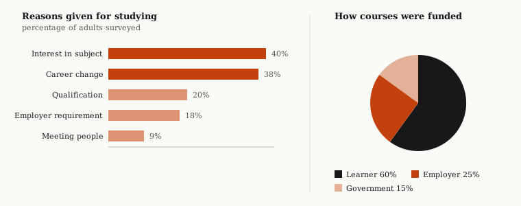
The chart below shows the reasons adults gave for studying, and the pie chart shows how their courses were funded.
Summarise the information by selecting and reporting the main features, and make comparisons where relevant.
Band 6 Model Answer
The chart below shows the reasons adults gave for studying, and the pie chart shows how their courses were funded. Overall, there are several reasons for studying and several ways of funding.
Interest in the subject was 40% and career change was 38%. Qualification was 20% and employer requirement was 18%. Meeting people was the lowest at 9%. For the funding, the learner paid 60%, the employer paid 25% and the government paid 15%. This shows that people who study for interest have to pay for themselves because employers only fund work-related courses.
The English is accurate and the figures are right. It is still capped at 6.
Band 7 Model Answer
The bar chart shows why adults chose to take a course, while the pie chart illustrates how those courses were paid for.
Overall, personal interest and career change were by far the most common motivations, with the remaining reasons trailing well behind. Regarding funding, the clear majority of learners paid for themselves, with external contributions making up a much smaller share.
Interest in the subject was the leading reason, cited by 40% of those surveyed, closely followed by career change at 38%. The remaining three reasons formed a distinctly lower group: gaining a qualification and employer requirement sat at around 20% and just under that respectively, while meeting people was the least common at under a tenth.
With regard to funding, learners themselves covered three-fifths of courses. Employers accounted for a quarter, and government support for the smallest share at 15%.
Six Differences
The introduction is paraphrased. The band 6 version copies the prompt, so those words are discounted and the answer is shorter than it looks.
The overview covers both visuals. Two motivations dominating in one, self-funding dominating in the other, joined by Regarding. No figures anywhere in it.
The body partitions cleanly. One paragraph per visual, because the categories do not overlap. Notice the second body paragraph never mentions funding.
Figures are grouped, not listed. Band 6 gives you eight numbers in a row. Band 7 groups the three minor reasons and names the shape first: a distinctly lower group.
Proportional language carries the pie chart. Three-fifths, a quarter, the smallest share. Repeating “per cent” five times is accurate and flat.
Nothing is explained. The invented causal sentence is gone and nothing replaces it.
Do’s and Don’ts
| Do | Don’t |
|---|---|
| Check whether the visuals share categories first | Assume one structure fits both shapes |
| Compare across the visuals when categories overlap | Give each chart its own paragraph when they overlap |
| Partition one visual per paragraph when they don’t | Force a comparison between unrelated data |
| Cover both visuals in the overview | Describe one chart and forget the other |
| Join unrelated findings with while or whereas | Claim one chart explains the other |
| Aim for 150–170 words | Report every figure on both visuals |
| Use a third, a quarter, the majority | Repeat “per cent” in every sentence |
| Spend four minutes choosing the structure | Start writing before you have read both visuals |
Practice
Read both visuals before you decide anything. That is the habit this task type rewards, and you build it by writing answers and getting them marked, not by reading about it.
You can check a Task 1 answer with the IELTS writing checker: paste the question and your response for an estimated band. It marks all four criteria separately, so you can see which one is capping your band.
Related: how to describe a line graph covers single-visual data tasks, how to describe a process diagram covers the non-data tasks, and how the writing band scale works explains what each criterion rewards.
Frequently asked questions
- How do I structure a mixed chart answer?
- It depends on one question: do the two visuals share categories? If they do, you have one dataset shown twice, so group by shared category and compare across the visuals. If they share nothing, give each visual its own body paragraph.
- Should I compare the two visuals?
- Only if they share categories. Two charts printed together are not automatically related, and inventing a comparison between reasons for studying and sources of funding costs you more than leaving them separate would.
- Does the overview have to cover both visuals?
- Yes, both, and with no figures. One overview covering the whole prompt is what the task asks for, joined with something like 'Regarding' to move between them.
- How long should a mixed chart answer be?
- 150 to 190 words. Under 150 is penalised, counted after copied prompt wording is discounted. Past 190 you are describing instead of selecting, and beyond 210 the length itself shows you lost the thread.
- How should I split the 20 minutes on a mixed chart task?
- Four minutes reading and planning, twelve writing, four checking. Do not cut the first four. Choosing the wrong structure costs you more than any sentence you could write in that time.
- Can I link the two charts as cause and effect?
- No. Claiming that people study out of interest because they fund their own courses is an invented relationship. Two charts printed side by side are not evidence of cause, and the claim is marked as unsupported content.