
A table is the one Task 1 question with no picture. The sources describe it plainly: tables are “just sets of numbers with no visual representation”.
A line graph does some of the work for you. A rising line is visibly a rising line. A table shows you sixteen numbers in a grid and leaves the pattern for you to find.
So the failure is predictable. Candidates read the grid aloud, row by row, until they run out of time or words.
The decision that fixes it is not about rows or columns. It is: which six numbers am I going to use?
Selection Is the Whole Task
You are not required to report the table. The sources say it directly: “it is not necessary to include every figure from the diagram in your answer”.
A four-by-four table holds sixteen figures. A band 7 answer uses five or six of them. The other ten are not omissions — leaving them out is the skill being tested.
Find the ones that carry meaning:
- the highest and lowest figures in the whole table
- where the greatest and smallest differences sit
- any exception — a figure that breaks the pattern its neighbours follow
Everything else is context you can describe in words without quoting.
There Is No Rule About Rows Versus Columns
Most IELTS sites will tell you to go row by row, or column by column. The sources do not, and neither should you.
What they require is that the grouping is logical — organised by similarity, difference or exception. Sometimes that runs along a row. Sometimes down a column. Often it runs diagonally across both, because the two rows that behave alike are not next to each other.
Read the table, find which entries behave the same way, and let the paragraphs follow that. The grid’s layout is a printing decision, not an argument.
Table Structure
- Introduction, about 25 words. Paraphrase the prompt. What is measured, where, and when.
- Overview, about 40 words. Two or three main features. No figures.
- Body one, about 55 words. The first group, with selected figures.
- Body two, about 50 words. The second group.
Write 150 to 170 words. Under 150 is penalised. Past 190 you are transcribing the grid.
The Introduction
Paraphrase the prompt, because copied wording is discounted from your count.
Table headers need particular attention. They are abbreviated to fit inside a cell, so they are rarely grammatical English. A column headed “65+” becomes “people aged 65 and over” in your sentence. Turning cell labels into prose is part of what the task is testing.
The Overview
Two or three features and no numbers.
Name the biggest thing in the table, the smallest, and the pattern that connects them. If two groups move in opposite directions as you read across, say so — that single sentence is worth more than any figure you could quote.
The weak version is safe and empty: the table gives information about several activities. That describes the existence of a table. Say what is in it.
The Body Paragraphs
One paragraph per group.
Quote a figure only when it supports a claim you have already made. A useful test from the sources: ask whether the number helps the reader understand why something is important. If not, it does not need to be there.
Where you name a figure, name the unit with it. A table’s units live in the header, and a bare “21.3” means nothing once it leaves the grid.
Table Language
Tenses
- Dates in the past → past simple.
- No dates → present simple. Tables often carry no year at all, and the present simple is then correct throughout.
- Projections → future forms, for that column only. Tables frequently include an estimate column, so check the header before you commit.
Comparison
A table can be static or it can track time, and the language follows.
Comparing categories at one moment, use rank and difference:
| Job | Language |
|---|---|
| Rank | the highest, the lowest, the largest, the smallest |
| Compare | more than, higher than, lower than, compared to, by comparison |
| Proportion | a significant majority, nearly half, a quarter of, a small fraction |
| Multiply | double, triple, twice as much as, twice as many as |
Tracking change across columns, use trend verbs: rose, fell, climbed, declined, levelled off.
Use many for countable data and much for uncountable. Hours, households and vehicles take many; revenue, water and time take much.
How It Is Marked
Four criteria, 25% each. On tables, Task Achievement caps most competent answers.
- Band 5 — “Key features which are selected are not adequately covered. The recounting of detail is mainly mechanical.”
- Band 6 — “Key features which are selected are covered and adequately highlighted. A relevant overview is attempted.”
- Band 7 — “presents a clear overview, the data are appropriately categorised, and main trends or differences are identified.”
Band 5 carries a second line that describes the table failure exactly: “There may be a tendency to focus on details (without referring to the bigger picture).” A table makes that failure easy, because the details are sitting there in rows waiting to be read out.
Two penalties land before your English is assessed.
Under-length. The 150-word minimum is counted after copied prompt wording is discounted.
Explaining the figures. A table records what was measured, not why. Suggesting that older people watch more television because they have retired is unsupported content.
Table Sample
An original task in the standard format. No dates, so this is a static table.
The table below shows the average number of hours per week that people in four age groups spent on four activities.
Summarise the information by selecting and reporting the main features, and make comparisons where relevant.
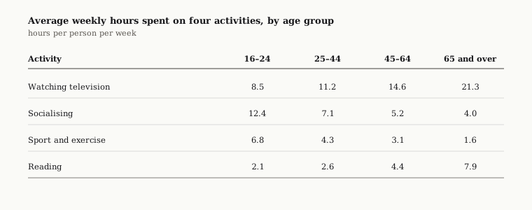
Read across each row before you write anything. Two activities climb steadily with age and two fall away. That is the grouping — and notice it runs across the rows, not down the columns, and the two rows that belong together are not adjacent.
Band 6 Model Answer
The table below shows the average number of hours per week that people in four age groups spent on four activities. Overall, the table gives information about how different age groups spend their time.
For watching television, the 16–24 group spent 8.5 hours, the 25–44 group spent 11.2 hours, the 45–64 group spent 14.6 hours and the 65 and over group spent 21.3 hours. For socialising, the figures were 12.4, 7.1, 5.2 and 4.0 hours. For sport and exercise, they were 6.8, 4.3, 3.1 and 1.6 hours. For reading, they were 2.1, 2.6, 4.4 and 7.9 hours.
All sixteen figures, all correct, and no reader could tell you what the table means. The overview says only that the table exists.
Band 7 Model Answer
The table compares how many hours a week four age groups devote to television, socialising, sport and reading.
Overall, the activities divide neatly in two: television and reading occupy steadily more time as people get older, while socialising and sport take steadily less. The leading activity therefore changes with age, from socialising among the youngest group to television among the oldest.
Time spent watching television climbs sharply across the age groups, from 8.5 hours a week among 16 to 24 year olds to 21.3 hours among those aged 65 and over — roughly two and a half times as much. Reading follows the same direction more modestly, almost quadrupling over the same range.
Socialising and sport move in the opposite direction. Socialising falls to about a third of its starting level, from 12.4 hours a week to 4.0, and sport declines more steeply still, to under a quarter of its original figure. Socialising nevertheless remains the more popular of the two at every age, while sport ends at under two hours a week.
Six Differences
The introduction is paraphrased. “How many hours a week four age groups devote to” replaces the prompt’s wording, so all of it counts.
The overview states the division. Two activities rise with age, two fall, and the leading activity swaps between the youngest group and the oldest. Three features, no figures.
The grouping cuts across the grid. Television and reading share a paragraph although they are the first and last rows. Socialising and sport share the other. Neither paragraph is a row and neither is a column — the pattern decided the paragraphs, not the layout.
Four figures, not sixteen. Band 6 quotes every cell. Band 7 quotes 8.5 and 21.3 to anchor the biggest change and 12.4 and 4.0 for the sharpest fall, then handles the rest in words: almost quadrupling, about a third, under a quarter.
The comparisons are inside the sentences. Roughly two and a half times as much, the more popular of the two, the same direction more modestly. Each links two figures rather than reporting one.
Units travel with the numbers. “8.5 hours a week”, not “8.5”. Once a figure leaves the grid it needs its unit attached.
Do’s and Don’ts
| Do | Don’t |
|---|---|
| Read every row before you write a sentence | Start writing from the top-left cell |
| Group by behaviour, wherever it sits in the grid | Assume the answer runs by row or by column |
| Quote five or six figures | Report all sixteen because they are there |
| Attach the unit to every figure you quote | Write a bare number with no unit |
| Put two or three features in the overview | Write that the table “gives information” |
| Turn abbreviated headers into full English | Copy “65+” straight into your sentence |
| Use present simple when the table has no dates | Default to the past simple out of habit |
| Report what the table measured | Explain why the figures came out that way |
Practice
A table gives you more data than any other Task 1 question and marks you on how much of it you leave out. That feels wrong the first few times, which is why it needs practising rather than reading about.
You can check a Task 1 answer with the IELTS writing checker: paste the question and your response for an estimated band. It marks all four criteria separately, so you can see which one is capping your band.
Related: how to describe a bar chart covers the same comparison language with a picture attached, how to describe a line graph covers change over time, how to describe a pie chart covers proportions of a whole, and how the writing band scale works explains what each criterion rewards.
Frequently asked questions
- Should I describe an IELTS table by rows or by columns?
- Neither rule holds. What the criterion requires is that the grouping is logical, organised by similarity, difference or exception. Sometimes that runs along a row, sometimes down a column, and often diagonally across both, because the two entries that behave alike are rarely next to each other.
- How many figures should I quote from a table?
- A handful, chosen to anchor claims you have already made. A four-by-four table holds sixteen cells; a band 7 answer might quote four of them and handle the rest in words, using phrases such as almost quadrupling, about a third, and under a quarter.
- Do I need an overview for a table?
- Yes, and it works the same way as on any other Task 1 visual: two or three main features, no figures. Without a clear one, Task Achievement caps at band 6 however accurate the detail is.
- How many words should a table answer be?
- 150 to 170. Under 150 is penalised, counted after copied prompt wording is discounted. Past 190 words you are transcribing the grid rather than summarising it.
- Do I need to include units when quoting from a table?
- Yes. Write 8.5 hours a week, not 8.5. Once a figure leaves the grid it loses the column heading that gave it meaning, so the unit has to travel with it.
- Can I explain the figures in a table?
- No. A table records what was measured, not why. Suggesting that older people watch more television because they have retired is unsupported content and costs you under Task Achievement.