
Bar charts look like the easy Task 1 question. The data is right there on the page, one bar per thing, nothing to interpolate.
That is why so many answers read like a caption list. Country A was 38%. Country B was 34%. Country C was 22%.
Every sentence is true and the whole thing sits at band 6.
Before you write, answer one question: does this chart show a single moment, or a period of time?
Magnitude or Movement?
The answer changes the language you need, and using the wrong set is the most visible error on this task type.
A single moment — categories compared at one date, or with no date at all. Household spending across four countries. Reasons people give for cycling to work.
The sources put it exactly: the focus shifts “from movement to magnitude”. Nothing rises or falls here, because nothing has time to. Write about size, rank and difference.
Trend verbs are wrong. A bar cannot fluctuate if there is only one of it. Writing that spending “increased to 38%” when the chart shows one year is an accuracy error, not a style choice.
A period of time — the same categories measured across several dates. Now you have trends, and the language is the same as a line graph: rose, fell, levelled off, peaked.
Group by shared behaviour. One paragraph for the categories that went up, one for those that fell or stayed flat.
The rest of this guide covers both, and flags which parts apply to which.
Bar Chart Structure
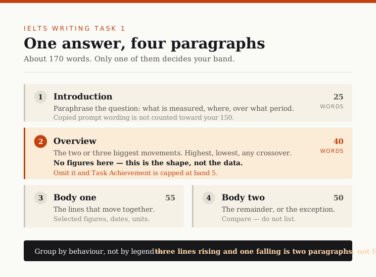
- Introduction, about 25 words. Paraphrase the prompt. What is measured, where, and when.
- Overview, about 40 words. Two or three main features. No figures.
- Body one, about 55 words. The first group, with selected figures.
- Body two, about 50 words. The second group.
Write 150 to 170 words. Under 150 is penalised. Past 190 you are listing rather than selecting.
The Introduction
Paraphrase the prompt. Copied wording is discounted from your word count, and a memorised opening can be excluded from assessment altogether.
There is a bar chart habit worth naming here. Chart labels are not English. They are abbreviated, capitalised fragments written to fit inside a legend.
Part of your job is turning them into grammar. A legend reading HOUSING becomes “housing” inside your sentence, lower case, with an article if the sentence needs one. Lifting the label verbatim reads as copying rather than describing.
The Overview
Two or three features, no numbers.
On a single-moment chart, the overview says which category leads, which trails, and whether the pattern splits the groups in some visible way.
On a time-period chart, it says which direction most categories moved and which one broke the pattern.
Either way, no figures. Not one. The numbers are evidence for the body paragraphs.
The Body Paragraphs
One paragraph per group, and the grouping is the whole decision.
Do not walk along the chart bar by bar. The sources call this the “robotic” description, “where each line or bar is described one by one in isolation”, and it is what holds a competent answer at band 6.
Group instead. On a single-moment chart, group by size: the dominant categories together, the minor ones together. Or split by whatever the chart is really contrasting — if two countries spend most on housing and two spend most on food, that is your two paragraphs, and you have found the chart’s actual shape.
Select the figures. A grouped chart with four categories and three measures holds twelve numbers. Use five or six.
Bar Chart Language
Tenses
Match the tense to the dates.
- Dates in the past → past simple.
- No dates at all → present simple. This catches people out. A chart with no year is describing a general state, so “housing accounts for 38% of spending”, not “accounted”.
- Projections beyond today → future forms, for that portion only.
Comparison and Superlatives
This is where a bar chart answer differs from a line graph answer, and where most of the marks are.
| Job | Language |
|---|---|
| Rank | the highest, the lowest, the most popular, the largest proportion |
| Compare | more than, higher than, lower than, less than, compared to, by comparison |
| Proportion | a significant majority, a small fraction, nearly half, a quarter of |
| Multiply | double, triple, twice as much as, twice as many as |
Two of those need care.
Twice as much, twice as many. Use much for uncountable data — revenue, water, electricity. Use many for countable — households, students, vehicles.
A strong verb cannot take a weak adverb. If your chart does show change over time, soar, plummet, rocket already carry their intensity. “Plummeted gradually” contradicts itself.
How It Is Marked
Four criteria, 25% each. On bar charts, Task Achievement caps most competent answers, and the overview is why.
The descriptor ladder:
- Band 5 — “Key features which are selected are not adequately covered. The recounting of detail is mainly mechanical.”
- Band 6 — “Key features which are selected are covered and adequately highlighted. A relevant overview is attempted.”
- Band 7 — “presents a clear overview, the data are appropriately categorised, and main trends or differences are identified.”
Read the band 7 wording again: the data are appropriately categorised. That is the grouping decision, written into the descriptor. It is not a stylistic preference — it is the criterion.
Band 5 has a second line worth knowing: “There may be a tendency to focus on details (without referring to the bigger picture).” That is the bar-by-bar answer described from the examiner’s side.
Two penalties land before your English is read.
Under-length. The 150-word minimum is counted after copied prompt wording is discounted.
Misreading the chart. Mistaking thousands for millions, or misreading which axis is which, costs Task Achievement marks directly. Check the axis label before you check anything else.
Bar Chart Sample
An original task in the standard format. No dates, so this is the single-moment case.
The chart below shows the percentage of household income spent on housing, food and leisure in four countries.
Summarise the information by selecting and reporting the main features, and make comparisons where relevant.
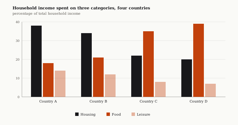
Look at the shape before the numbers. Two countries spend most on housing, two spend most on food, and leisure is the smallest everywhere. That is your grouping, and you can see it without reading a single figure.
Band 6 Model Answer
The chart below shows the percentage of household income spent on housing, food and leisure in four countries. Overall, the four countries spend their income in different ways.
In Country A, housing was 38%, food was 18% and leisure was 14%. In Country B, housing was 34%, food was 21% and leisure was 12%. In Country C, housing was 22%, food was 35% and leisure was 8%. In Country D, housing was 20%, food was 39% and leisure was 7%. Country D spent the most on food and Country A spent the most on housing.
Accurate in every figure, and capped. Note also that the tense is wrong throughout — the chart carries no date.
Band 7 Model Answer
The bar chart compares how much of their income households in four countries devote to housing, food and leisure.
Overall, the four countries fall into two clear pairs: housing dominates spending in the first two, while food takes the largest share in the other two. Leisure is the smallest category everywhere, and it shrinks steadily across the group.
Households in Countries A and B put the largest share into housing, at 38% and 34% respectively. Food takes noticeably less in both, around a fifth of income, so housing costs them roughly twice as much as feeding themselves.
The pattern reverses in Countries C and D, where food accounts for over a third of household income and housing for only about a fifth. Leisure is consistently the smallest outlay, falling from 14% in Country A to just 7% in Country D.
Six Differences
The introduction is paraphrased. “How much of their income households devote to” replaces the prompt’s wording, so every word counts toward the 150.
The overview names the shape. Two pairs, a reversal between them, and one category that is smallest throughout. Three features, zero figures.
The body groups by pattern, not by country. Band 6 gives each country a sentence in chart order. Band 7 puts A and B together because they behave the same way, then C and D. The reversal — the single most interesting thing on the chart — only becomes visible once they are grouped.
The tense is right. No dates on the chart means present simple: housing dominates, food takes, not was and spent.
Comparison is inside the sentences. Roughly twice as much, the pattern reverses, noticeably less. Each links two things. Band 6 reports one thing at a time and then bolts two comparisons on at the end.
Figures are selected. Twelve numbers exist. Band 7 uses six, and each supports a claim already made.
Do’s and Don’ts
| Do | Don’t |
|---|---|
| Check for dates before choosing your language | Use trend verbs on a chart with no time axis |
| Use present simple when the chart has no dates | Default to the past simple out of habit |
| Group the bars by pattern before writing | Walk along the chart bar by bar |
| Put two or three features in the overview | Put a single figure in the overview |
| Rank with superlatives and comparatives | Repeat “was” for every category |
| Turn chart labels into grammatical English | Copy the legend’s capitals into your sentence |
| Use twice as many for countable data | Say twice as much for households or students |
| Check the axis label before you start | Mistake thousands for millions |
Practice
The decision that carries this task type takes five seconds: dates or no dates. Everything about your grammar follows from it, and getting it wrong is visible in every sentence.
You can check a Task 1 answer with the IELTS writing checker: paste the question and your response for an estimated band. It marks all four criteria separately, so you can see which one is capping your band.
Related: how to describe a line graph covers charts that always show change over time, how to describe a pie chart covers proportions of a whole, how to describe a table covers comparisons with no chart to read the pattern from, how to describe mixed charts covers tasks with two visuals, and how the writing band scale works explains what each criterion rewards.
Frequently asked questions
- Should I use trend language on a bar chart?
- Only if the chart covers a period of time. Check for dates before you write a word. A chart showing a single moment is about magnitude, rank and difference, so writing that spending increased to 38% when only one year is shown is an accuracy error, not a style choice.
- What tense should I use for a bar chart with no dates?
- Present simple. A chart with no year is describing a general state, so write that housing accounts for 38% of spending, not that it accounted for it. Defaulting to the past simple out of habit is one of the most visible errors on this task type.
- How do I write a bar chart overview?
- Two or three features and no figures. On a single-moment chart, say which category leads, which trails, and whether the pattern splits the groups visibly. On a time-period chart, say which direction most categories moved and which one broke the pattern.
- Should I describe each bar in turn?
- No. Walking along the chart bar by bar is the robotic description that holds a competent answer at band 6. Group by pattern instead: the dominant categories together, the minor ones together, or whatever contrast the chart is actually built around.
- How many words should a bar chart answer be?
- 150 to 170. Under 150 is penalised, and the count is taken after copied prompt wording is discounted. Past 190 words you are listing rather than selecting, which is what the criterion marks.
- Is it 'twice as many' or 'twice as much'?
- Use 'many' for countable data such as households, students and vehicles. Use 'much' for uncountable data such as revenue, water and electricity. It is a small distinction that appears in almost every band 6 script.